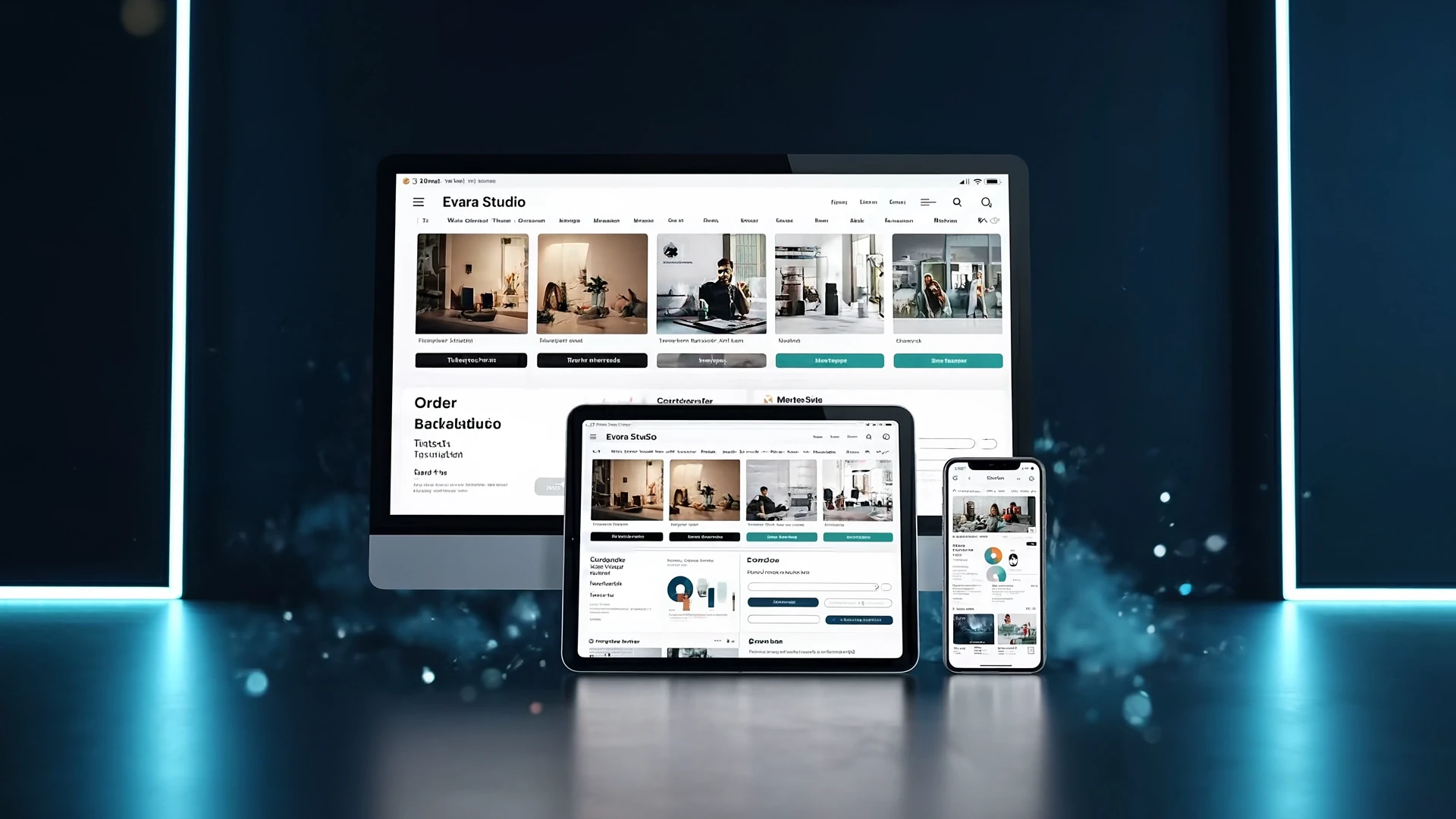
Opening website
Loading Evara...
A polished experience is almost ready.
Powered by Evara
Start from ecommerce templates that already understand product pages, catalog structure, checkout, customer accounts, inventory, CRM, analytics, automation, and recovery paths.
These are not paid extensions. They are baked into the template you launch on — turn them on, configure, sell.
Categories, options, variants, inventory counts, and SEO-clean product URLs — all editable from the same builder as the rest of the site.
Cards, Apple Pay, Google Pay, and digital wallets — secure checkout flow inside the platform with no third-party redirect.
Automated email sequences trigger when carts go quiet, with discount codes and product previews wired into the marketing engine.
Real-time stock counts, low-stock alerts, fulfillment status, and order history — all visible from the admin dashboard.
Every storefront template ships responsive at 360px with touch-friendly product cards, sticky add-to-cart, and a one-tap checkout.
Schema markup, Open Graph cards, sitemap entries, and AI-scored product copy — so the storefront ranks before you spend on ads.
Open any e-commerce template in the live preview — click categories, open product pages, take a test checkout. Sign up and that exact storefront is the one you launch on.
Stripe, Square, and PayPal supported out of the box — pick one or run all three depending on the customer base.
Display prices in the visitor currency, accept payment in the merchant currency, and let Stripe handle conversion — no plugin to wire.
Customers create accounts, review past orders, save addresses, and track shipments — without a separate customer-portal product.
Sell recurring boxes, memberships, or service subscriptions on the same checkout — billing and renewals run inside the platform.
Customers request returns from their account; you approve, refund, and update inventory in one click from the admin order view.
Conversion funnels, top products, average order value, and cart-recovery performance — all in the same workspace as the storefront.